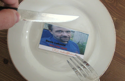
 So I'm going through a crate of business cards with an event guru, when she stops and shows me the worst business card she's ever seen. I'm a strong believer that learning is a life long process and you can learn as much from your mentors as your tormentors, so let me preface by saying I'm not being mean. I'm just going to vivisect this hot mess for the benefit of others.
What makes this card great
Out of 1,500 plus cards, this had the most conversational appeal.
What makes this card not-so great
You can already see the big issue. If he were an artiste you might chalk it up to use of ironic design and embrace its brilliant lack of flair, but we have to weigh the odds that this guy will more likely become patient zero for a new site called yourbusinesscardmakesmebarf.com.
Nothing about this card expresses the mildest glimpse into what his business is. It's got a name, and a phone number, and a hotmail address. The end. No job title, no indicative graphics, no URL. Designers use a hierarchy to create emphasis of your information. Your name, company, contact info, some kind of visual identifier, logo or wordmark associated with your business. If you're in a more competitive field of business as an example, having a very clear title of what you do is a fantastic idea too. Otherwise, consider throwing on a recyclable logo.
Photos on business cards is more of a niche characteristic, like people in real estate value who place a premium on making themselves appear friendly, approachable and visually memorable. In this case, we have a photo of John Doe relaxing by a fence on a planet that may have more gravity than earth, like one of Jupiter's moons. Perhaps he wanted to appear friendlier, and just had his smile stretched out rather than splurging on a second photo.
Fonts and colours. Don't question the effectiveness of a clean business card. Believe. If your card is awash in colour, you will stand out, but your card will be less useable. Same goes for type faces. The less the better. In this case, he two colours for fonts. Good boy, but he's using three fonts on a card with three lines. Consistency increases digestibility.
When it comes to printing on unusual stock (wood, plastic, metal) or creating crazy sizes to make your card unique, remember that if it's too awkward to fit in someone's wallet or rolodex, it's not too awkward to fit in someone's garbage. This guy really jumped the shark and committed the triple sin of lamination. First, your card is now too wide to fit in a standard wallet card sleeve. Second, and really this should be first: lamination is cheesy. And third, although this card will outlive us all, standing against the elements for thousands of years so future historians can ignore him too. And why will they know so little about him? You can't write on lamination. A lot of people like to make personal notes on your business card; quick memos about your specialties or how they know you. It's a nice idea to leave white space or a mostly blank backside for this purpose.
If you're looking for cool inspiration, here's a Flickr set that will treat you right. And when in doubt, consult a designer. Show them what you have and get a second opinion.
via videosift.com


